

 LinkBack URL
 About LinkBacks

 How to make your app look great on every screen
Imagine, for a moment: Youve just spotted the perfect pair of shoes online. Theyre the right color, theyre designed impeccably, and you cant wait to get them delivered and on your feet. Except, wait theyre only made in size 7. And sadly, while you might be able to cram your feet in and wear them on occasion, they wont be comfortable enough for daily use.
Now, most shoe manufacturers dont offer their shoes in just one size. Instead, when they create a new shoe model, they offer a range of sizes with the same design and functionality so that the customer can enjoy the one that fits best.
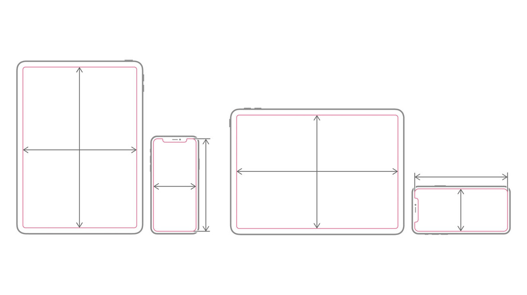
Its the same for really great apps: When developing, you want to create an interface that adapts to a range of screen sizes with the same design and functionality for all. That way, whether someone uses iPhone SE or iPad Pro to view your app, they still get to have an enjoyable and comfortable experience.
Below, weve collected some of the best ways you can adapt your apps interface so that it looks great, regardless of device.
Universal design
While you can design solely for specific platforms like iPhone, iPad, or Mac, consider creating a universal version of your app that supports multiple devices. This lets your customer choose how your app fits into their life, and its the most adaptive experience you can provide. Whether youre creating apps designed for a single platform or multiple devices, however, they should support all available screen sizes and size classes for those devices.
Ready to launch
A great app experience starts with a universal launch screen: Designing the right one can make a world of difference in how quickly you can immerse people into your user interface. Use Xcode to create a launch screen storyboard theyre flexible and support all device screen sizes, allowing you to use a single storyboard to manage your launch screens on every platform you support.
Learn more about designing launch screens for seamless starts >
Get into Auto Layout
When crafting your interface, Auto Layout can help you adapt to any screen size. It provides guidelines for your app that relate the positioning of one piece of content to any other content or views. This lets your content scale and reflow in the manner you intend it. Avoid using absolute screen coordinates, as those may result in off-center buttons or awkward content flow on different screen sizes.
Learn more about Auto Layout in the Developer Library >
Explore SwiftUI
If your app is built for iOS 13, iPadOS 13, watchOS 6, tvOS 13, or macOS Catalina, you may want to also consider implementing SwiftUI. The declarative nature of SwiftUI ensures that your content is adaptable out of the box, and that code is also often reusable when building apps for other Apple platforms.
Master multitasking
If youre developing an app that supports iPad, remember that people can use it in a variety of ways: They can browse the app in full screen, put it next to another app in Split View, pull it up in Slide Over, or (if your app supports it) even view multiple windows side by side. Consider each of these size classes and how your interface can successfully adapt to provide the best experience.
Get started with multitasking >
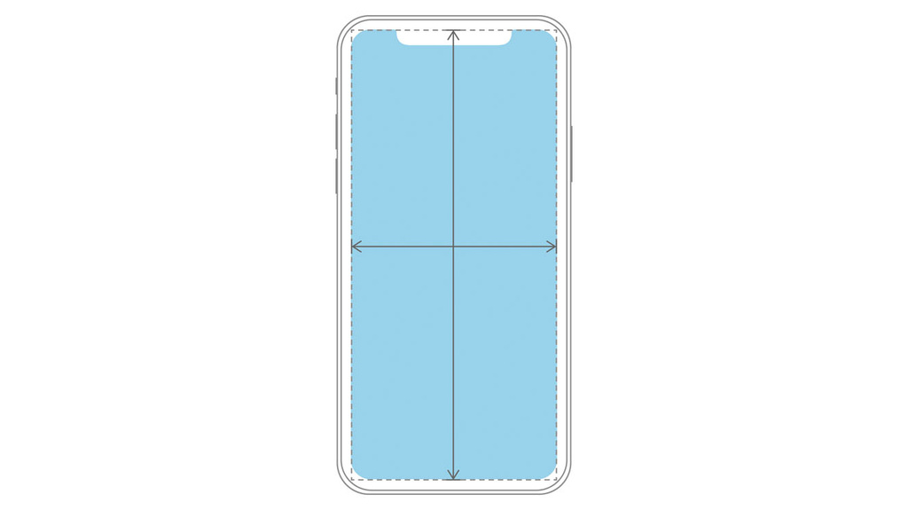
Keep your content readable
It can be challenging to design for a great reading experience on all devices if you have text- or image-heavy content in your app. Let the Readable Content Guide do the heavy lifting for you: The layout guide defines an area that can easily be read without extra effort.
Learn more about the Readable Content Guide >
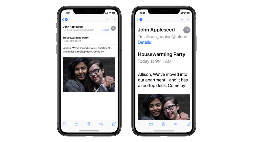
Additionally, make sure your reading experience is accessible. Many people prefer to change their text size to something other than the default. Supporting Dynamic Type ensures your text scales to what your customer has indicated they want. It also ensures that as the text gets larger or smaller, other on-screen elements dynamically move to accommodate these changes.
Learn more about designing with text weight and size in mind >
Learn more about scaling text set in a custom font >
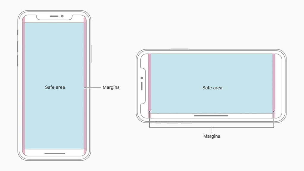
Use safe areas when designing your interface to ensure your views will never over or underlap other content or hardware elements, regardless of device.
Learn more about safe areas and safeAreaLayoutGuide >
Craft your queries effectively
While its helpful and often critical to know the device capabilities on which your app is currently running, be mindful to avoid checking for a known set of devices and collating behaviors based on those results. Instead, query for feature availability and provide conditional paths based on the results of that check.
For example, when building an AR app, you can use the isSupported property of the appropriate ARConfiguration subclass to see whether a device supports a given configuration.
class var isSupported: Bool { get }Preview your work
In Xcode 11, you can do a lot of your basic interface testing directly in Previews. This allows you to see how your interface handles different conditions, devices, and use cases. You can automatically see how Dynamic Type might render if your app is running on iPhone SE, for example, or view different localization options.
While Previews are designed to work with SwiftUI, you can also use them with your existing Swift or Obj-C views to make sure your UI remains adaptable as you change your code.
Resources
Watch Mastering Xcode Previews >
Learn more about SwiftUI >
Learn more about designing for adaptive interfaces >
Learn more about using typography on all screen sizes >
More...


Bookmarks